
Clap & Slap or CLAP & SLAP – which is it? The title of Agnietė Lisičkinaitė and Igor Shugaleev’s outstanding duet sometimes appears in all caps, sometimes with initial caps, depending on where it’s published. Thus, in our very first meeting at Springback Academy and before seeing any of the work, we were already considering elements of editorial and typographical style, and figuring out which was the authorised, or most authorised version. Evidence pointed to CLAP & SLAP.
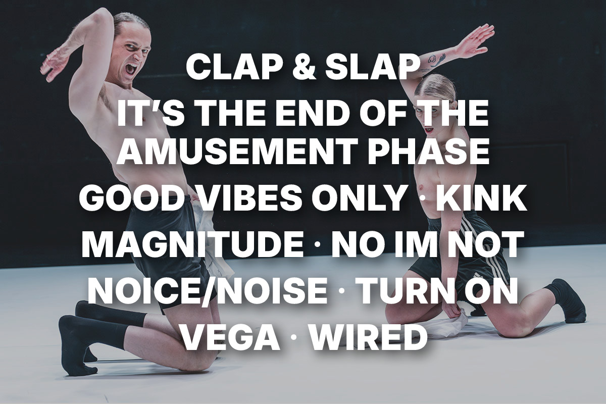
Damn! I was rooting for initial caps, because typographically it looks way better. Still, I was clearly on the losing side. A quick glance at the Spring Forward festival programme revealed a whole class of capitalist entitlements: alongside CLAP & SLAP there was VEGA, MAGNITUDE, TURN ON, NOICE/NOISE, KINK, NO IM NOT, WIRED and IT’S THE END OF THE AMUSEMENT PHASE, as well as the partially capped GOOD VIBES ONLY (beta test). And I’m not even counting BMP – Beats per Millennium, because it uses caps only for an acronym, and I’m okay with that. (Or even: OK with that.) But overall, CAPS had spread over the festival like a RASH.
What’s the objection to ALL CAPS? To me, ALL CAPS within text that is not in itself ALL CAPS feels like someone constantly demanding attention, regardless of what they are saying. Granted: the attention-grab is the basic move of our current media landscape – but it’s not playing nice with either the subject or the reader.
WHAT ABOUT TEXT THAT IS IN ALL IN ALL CAPS? EVERY LETTER IS EQUAL, SO IT’S VERY DEMOCRATIC. ISN’T THAT OK? (OR: OKAY?) NOT TO ME. AND NOT TO YOU, I IMAGINE. TAKE THIS PARAGRAPH: DOES IT LOOK OKAY? DOES IT SOUND OR FEEL OKAY? I REST MY (UPPER) CASE.
how about no caps at all? much easier to read. allows content to shine without being eclipsed by tone. plenty of languages manage just fine without upper and lower case letters, and sometimes i think we’d all be better off without the distinction. and yet: capitals can and do make reading easier: marking sentences, for example, or distinguishing between names, titles and words. so yes, i would be okay with some capitals among lower case text, as long as they were used sparingly. the one habitually capitalised word i would love to cut down to size as a matter of principle is the word i. it’s egotistical and self-important, and needs to get over itself, for all our sakes.
In short: let us use upper and lower case letters according to our needs (not wishes) and their abilities. That’s kind of socialist, isn’t it – but in a pragmatic rather than an ideological way.
There’s another reason, in this day and age, that i have taken against capitalisers: donald Fucking trump. Read any of trump’s idiot Pronouncements, and you will see him Capitalising all over the shop like a Dodgy Salesman flogging useless Guff and empty Promises. It’s pompous, entitled, self-styled, and misdirects our attention away from values such as Quality and Meaning. SAD!
In conclusion, i am okay with capitals where they are genuinely useful rather than dissimulating, aggrandising, identitarian or attention-seeking, and i am not okay with this ENTITLED RASH of ALL CAPS, because WHY EVEN?
One more thing. Instead of obsessing over capitalisation, i think we could usefully redirect our attention towards another aspect of our written language: punctuation. It is unobtrusive yet immeasurably helpful, often overlooked and definitely undervalued. Never mind those shouty, entitled caps, let’s give these important but near invisible punctual workers the credit they deserve – and yes, i’m looking at you, NO IM NOT. Wouldn’t you like an APOSTROPHE?